Dr. Pod redefines the check-in experience; promoting privacy, comfort, and independence. It makes the transition to a new doctor more accessible to new patients aged 18-22, specifically those transitioning from the pediatrician to the physician.
Project Sponsored By Cognizant
Target User Group:
18-22 year olds
Pediatrician to Physician Transition:
Transition from a family centered practice to a patient centered practice presented problem areas.
For medical professionals, the check-in
process is streamlined.
This is not so true for the patient.
Our group interviewed 4 patients that had recently been to the pediatrician or physician. The main takeaways from these four include:
Online check-in is preferred.
Patients prefer in person visits over telehealth visits.
patients typically get reminders via text or email about their appointments.
Many pediatricians still use traditional check in methods, while adult physicians use online
check-in and healthcare apps. There is a learning curve when transitioning between doctors.
Interviews with Patients
Patients’ Implicit Needs
Knowledge about personal and family health history
Understanding health insurance plans
Health Literacy
Ability to schedule and attend appointment alone
Understanding their own health (health literacy)
Independence
Feeling prepared for an appointment with proper documentation
Acceptance by medical staff and others in the waiting room
Comfort
Less paperwork
Shorter wait times
Quick Treatment
Help throughout the check-in process
transitioning from the pediatrician to physician
Guidance
Economic security
Safety and Helth
Stability
Takeaways From Overall Research
Although it wasn’t always the check in procedure available for some primary care offices,
an online process is preferred by patients and doctors.Most students aged 18-22 still visit their pediatrician, despite being an “adult.”
This is mostly due to convenience and comfortability.Young adult patients rely on their parents when it comes to doctors appointments.
How can we improve the check in experience at primary care offices for patients ages 18-22?
This led us to our problem statement:
Design Goals
Find an effortless way to communicate between patients and doctors outside of appointments
Comply with HIPAA regulations
Discover a more efficient way to fill out forms
Eliminate stress around canceling appointments
Increase health literacy in young adults
Decrease anxiety within patients when
communicating personal history with doctor
Make a simple interface that is understood by all ages
Promote independence in young adults to
prepare them for a physician
Make a welcoming atmosphere in the waiting room
Create a more efficient way to use telehealth technology
Find efficiency in the waiting room
Schedule matching with doctors when creating appointments
Ideation & Concept Development
Proposed Solution
+
A redesign of the primary care physician check-in experience, combining user interface and physical experience design. This is done by integrating
a healthcare app with the check-in pod, which will promote comfort, independence, and privacy during primary care doctor’s visits.
Why an app?
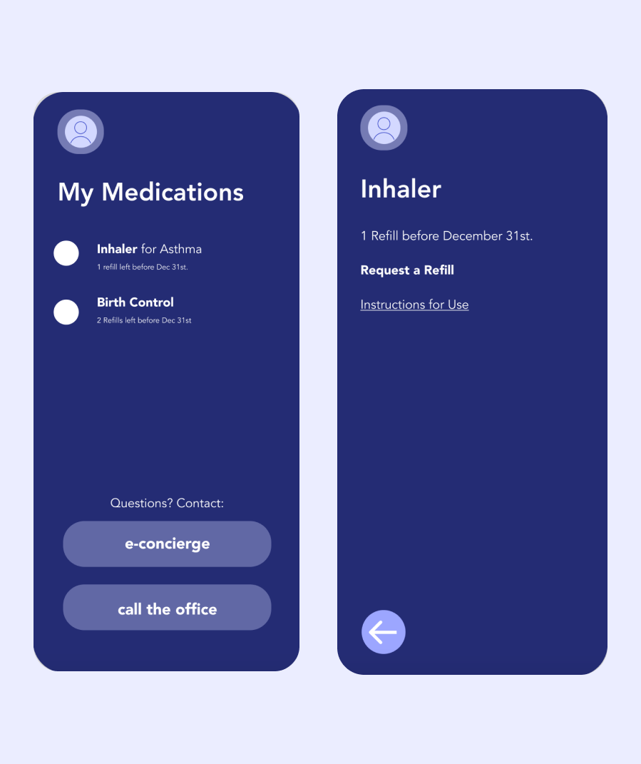
The app serves as a healthcare hub for the patient. Before they arrive to their appointment, they can fill out required forms. They are able to easily access their medical history (immunizations, surgeries, test results, past visits, etc.) and medications. Appointments can be scheduled from anywhere, without having to wait on the phone with a receptionist. Patients are able to confidently take charge of their office visits with the help of the symptom tracker and e-concierge service.
Features
Contactless check-in
Personal health ID
Medical forms
Symptom tracker
Appointment scheduler
Medication and prescription information
E-concierge for non-urgent health question
Functional Prototype
Create an Account & Log-in
Home Screen
Personal Health ID Profile
Schedule Appointment
Medical Forms
Message a Healthcare Professional
Contactless Check-in
Medications and Prescriptions
Symptom Tracker
Pod Screen
Functional Prototype
Contactless Check-in
Confirm I.D. & Fill out Forms
Home Screen
“Me” Screen & Message Doctor
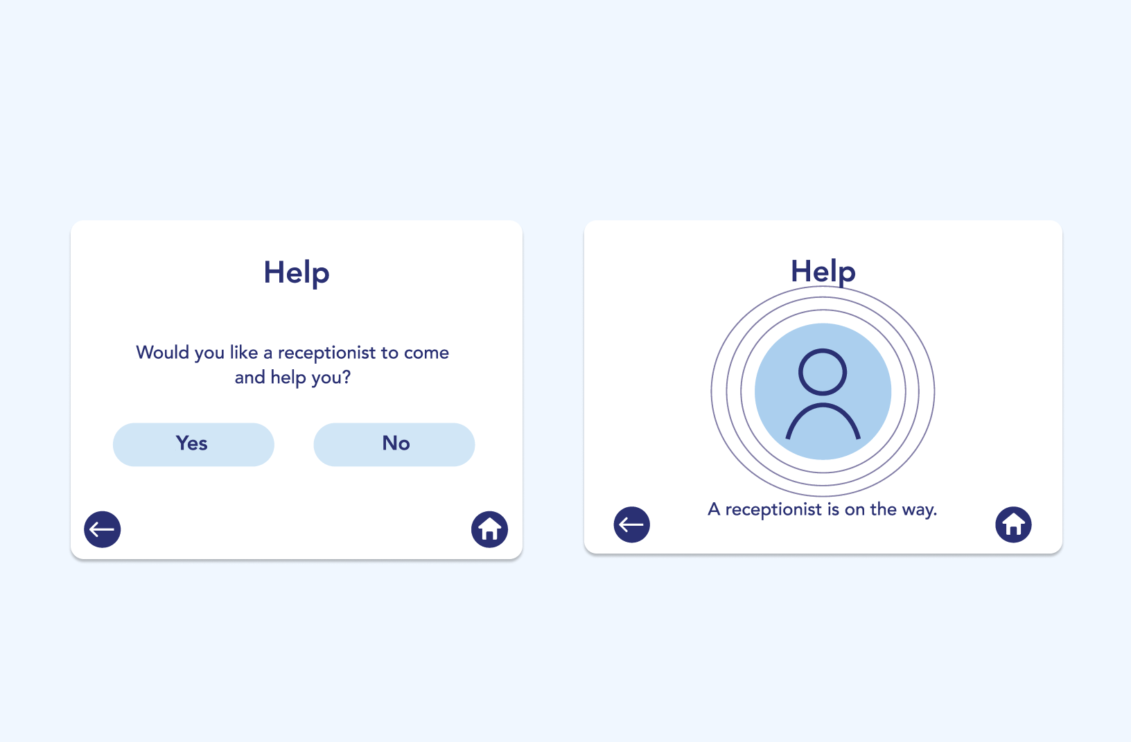
“Help”
“Learn”
Room is Ready
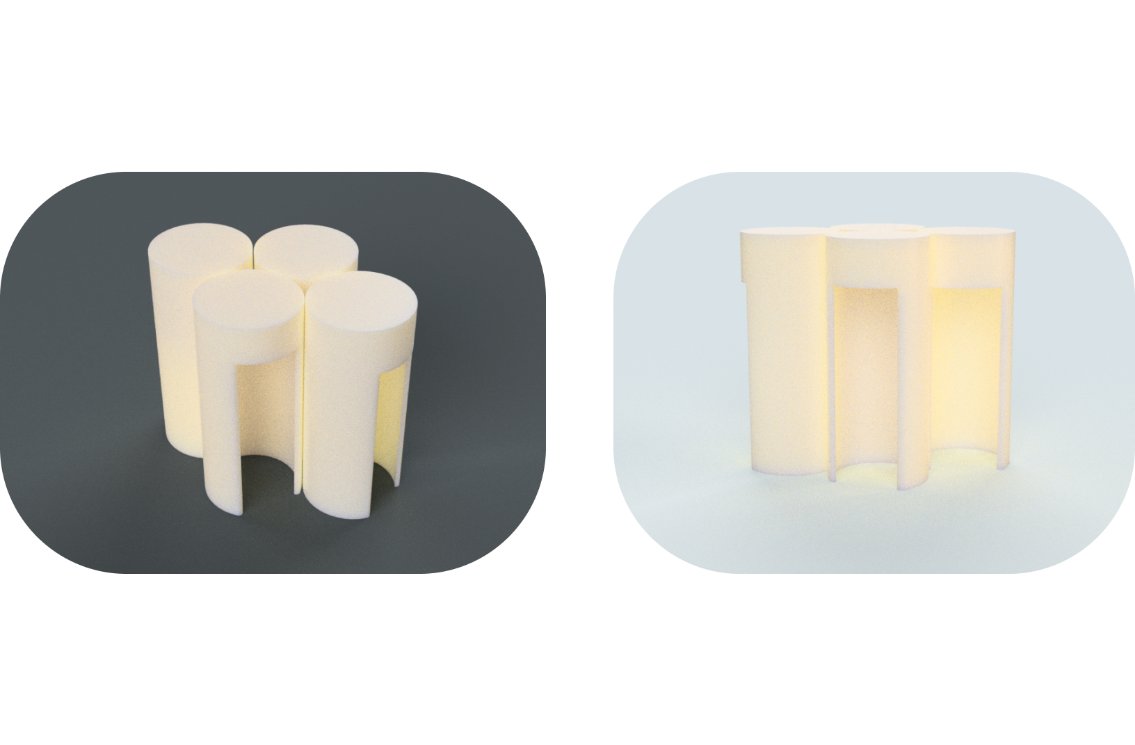
Modular Pod Inspiration Images
Form Exploration
Concept Renderings
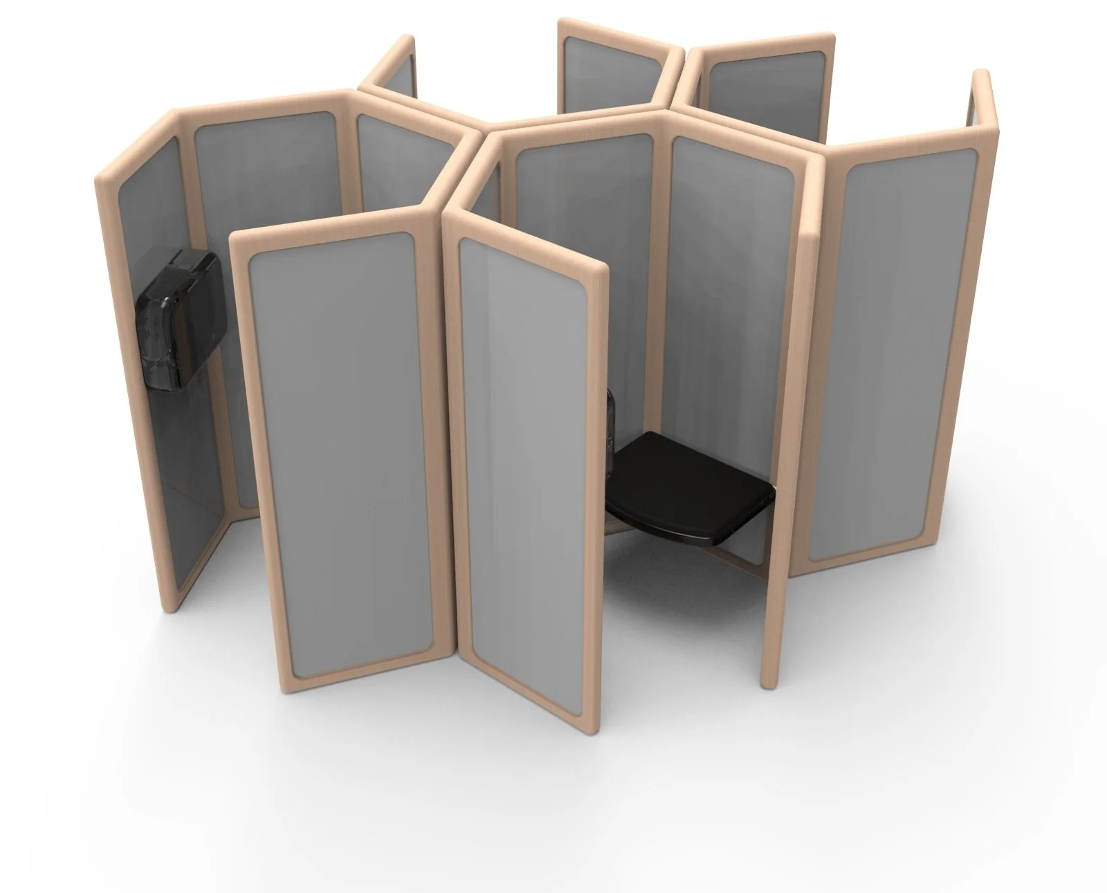
The Pod
In the survey, pod 3 was consistently the most favorable in regards to every factor: comfort, safety, accessibility, and aesthetics. This made it an easy decision to continue with this design throughout the rest of our project.
Additionally, the hexagon shape allowed for a cohesive and structural modular structure within the pod system to allow for easy access and comfort, which was one of our main goals within the design.
Full-Scale Model
This sketch shows how the pod was built, including wall dimensions and how the tabs were spaced out.
Anthropometry Considerations
We decided to use a folding chair to replicate the seating arrangement inside of the check-in pod. The works-like tablet model for the pod screen was propped-up using a high stool, which was the most ergonomic for all possible seating positions in the foldable chair at a set distance.
User Testing
“cozy,” “very private,” and “closed-off.”
Privacy
“intimidating,” and “not inviting.”
Solution: a frosted acrylic that will allow for more light.
Comfort
“open,” “large,” and “sparse.”
Space and Accessibility
Final Concept
Side/Overall View
Top View
Seat Mechanism


